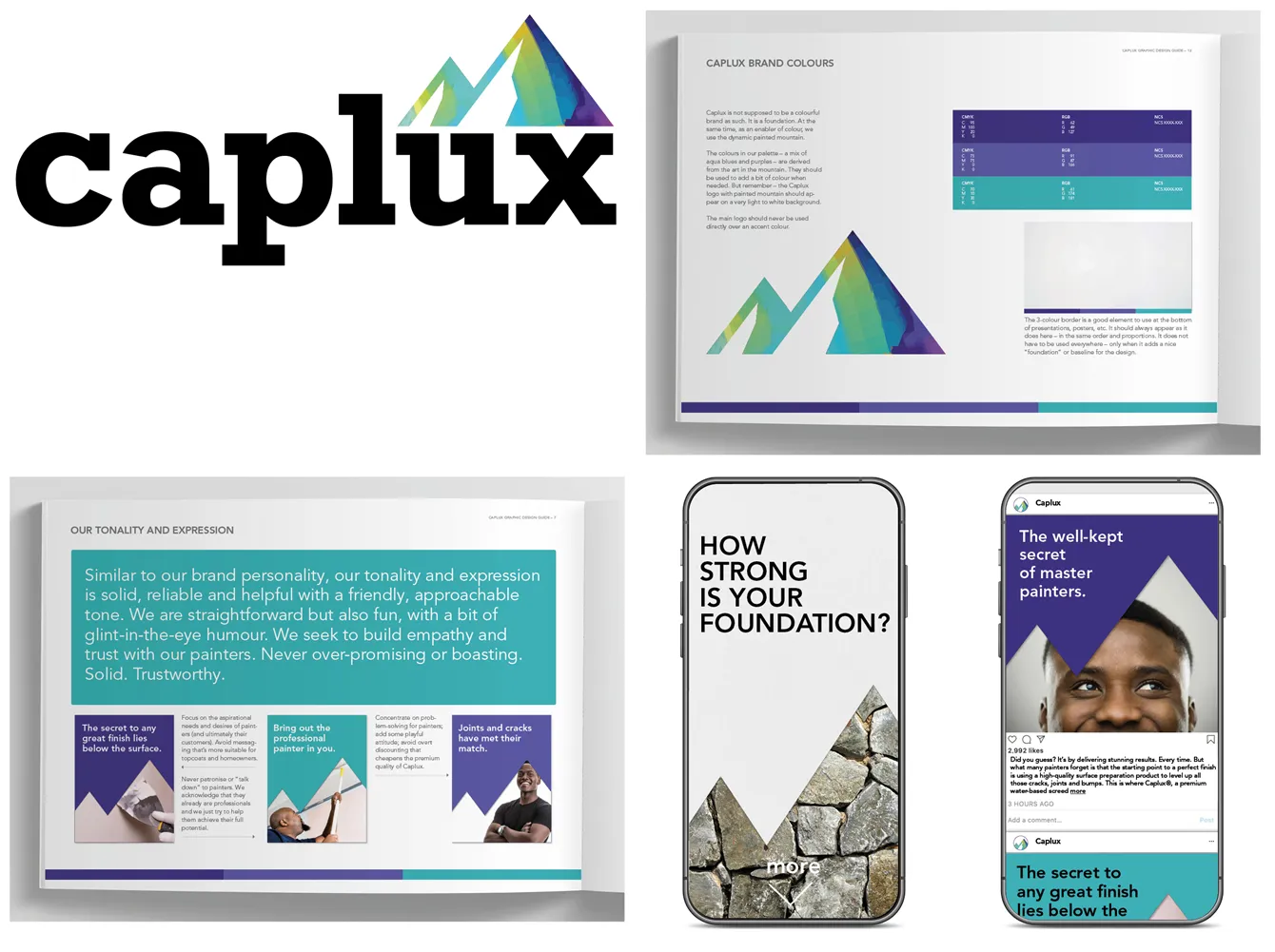
Branding repositioning, new logo and identity. Like many companies selling licensed products, Nigeria-based CAP is keen to develop its own higher margin paint brands. The challenge, of course, is how to build a brand from scratch (more or less) and avoid cannibalizing your other products. The solution involved taking a holistic view of the entire portfolio to establish a clear price point, function, personality and target audience.
Our client. Chemical and Allied Products Plc (CAP) is Nigeria’s largest and fastest-growing decorative paint brand. Founded some 60 years ago, the Lagos-based group is publicly traded on the Nigerian Stock Exchange and serves a market of 200 million. Today, its portfolio mainly comprises locally licensed brands such as Dulux, Sandtex and Hammerite. However, CAP has ambitious plans to develop more private-label products, such as Caplux, a homegrown CAP brand that had not been given so much attention.
Our assignment. The main challenge for Caplux was an unclear brand position in the market. It was being sold in the standard paint category in head-to-head competition with its Sandtex brand (licensed from Portland) – for everything from topcoats to undercoats. This meant it cannibalized business from Sandtex, a better-known brand, sold through wholly owned outlets and with development potential. Many consumers and professional painters already perceived Caplux mainly as an undercoat, to be used with its top-end Duplex topcoat or another brand. However, the position was somewhat fuzzy since it could also be used as a topcoat. To grow sales volumes, CAP wanted a sharper positioning, brand personality and new identity.
Our solution. During workshops in Lagos, it became clear that to unleash the growth potential of Caplux, we needed to reposition it in the portfolio as a high-quality surface preparation product. Together with topcoats like Dulux (premium) or Sandtex (standard), it would thus form the total solution to create a perfect finish. We decided that Caplux should be positioned as “the painter’s best friend” – the starting point for a perfect job, no matter what topcoat you’re using.
Our results. Our new positioning line, “Your foundation for perfection,” helped to clarify what the product was for and the desired end result – a perfect finish and a job well done. Together with their team we developed a new brand personality and identity of a solid, helpful and reliable brand, with a bit of humor. The new logo, with its bold, sturdy typeface, also reflected the foundation we provide – topped with a mountain of color to show the end aspiration. The campaign is currently under development.
